ShopDreamUp AI ArtDreamUp
Deviation Actions


Suggested Deviants


Suggested Collections


You Might Like…


Featured in Groups


Description
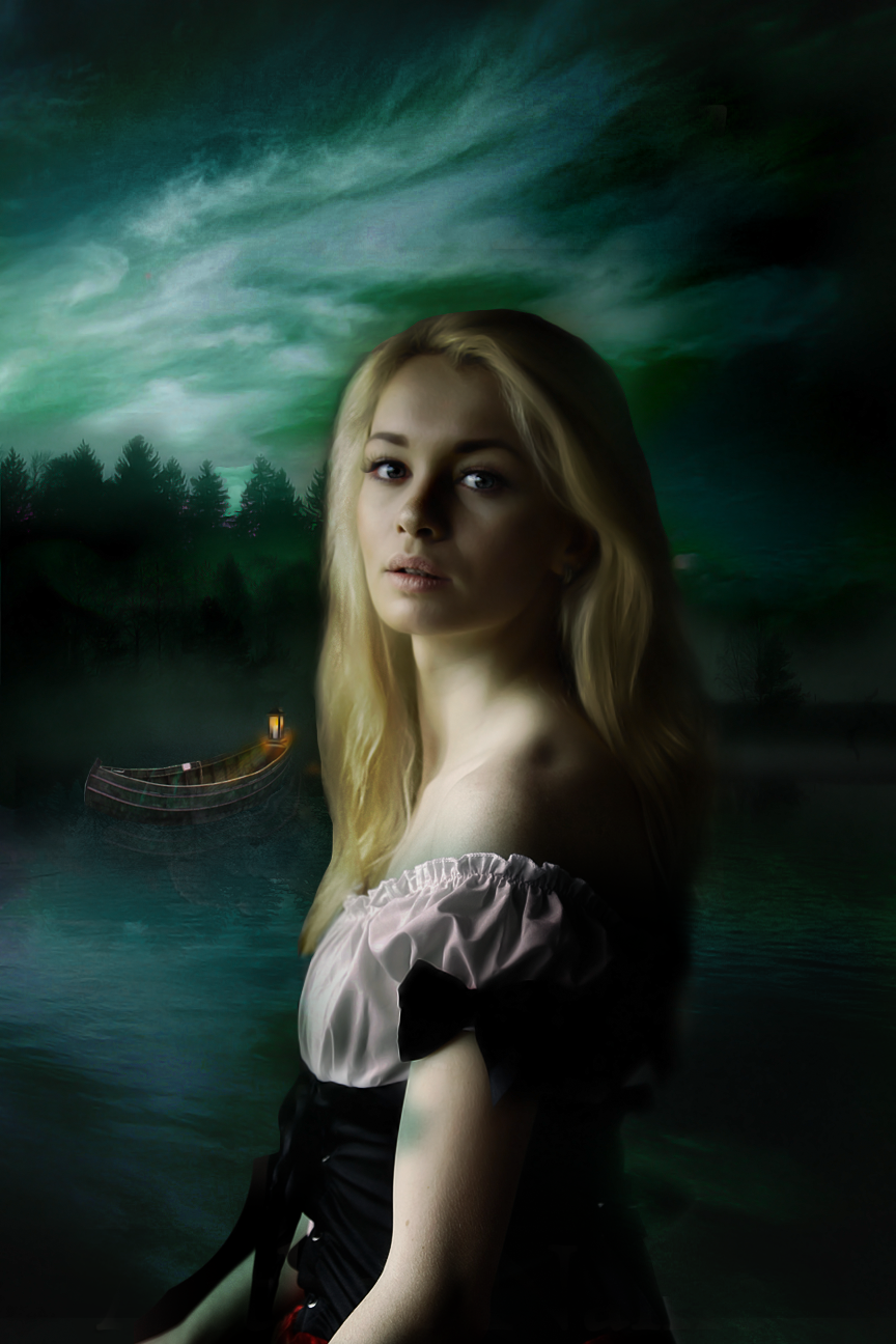
Book cover made for 
Edit: text removed
Stocks used:
New Zealand scenery stock pack 2
Snow 4
lantern png
boat on land 01
Misty Lake
Congratulations challenge scenery 2 + model stockCongratulations to the following artists for winning the polls. You will have you artwork made ready to sell as book covers and will be displayed on my page here www.facebook.com/pages/Cathlee…
Poll 1 https://cathleentarawhiti.deviantart.com/journal/poll/5300188/
Winner
Poll 2 https://cathleentarawhiti.deviantart.com/journal/poll/5302318/
Winner
Poll 3 https://cathleentarawhiti.deviantart.com/journal/poll/5304143/
Winner
Poll 4 https://cathleentarawhiti.deviantart.com/journal/poll/5307539/
Winner
Poll 5 https://cathleentarawhiti.deviantart.com/journal/poll/5309577/
Winner
I have also chosen these artworks to make into book covers -:origin()/pre12/818a/th/pre/f/2015/163/1/8/memory_lane_by_justrootinground-d8x2bts.jpg)
:origin()/pre03/2484/th/pre/i/2015/164/1/a/on_the_run_by_reginaflumenta-d8x69l3.jpg)
:origin()/pre05/3f2b/th/pre/i/2015/165/0/8/scarlett_by_tina1138-d8xcam7.jpg)
:origin()/pre08/cf33/th/pre/f/2015/164/d/6/devouring_passion_by_passion_aesthete-d8x3v8z.jpg)
:origin()/pre11/7784/th/pre/i/2015/168/c/c/dreams_and_fantasy_by_energiaelca1-d8xnmj3.jpg)
:origin()/pre12/566e/th/pre/i/2015/166/a/2/help_me____ayuda_me_by_mvicen-d8xeczo.jpg)
:origin()/pre01/55d5/th/pre/f/2015/165/d/d/prayer_by_mahhona-d8xb1n6.jpg)
:origin()/pre05/3633/th/pre/i/2015/175/b/b/at_sunset_by_ignisfatuusii-d8yjv5j.jpg)
Edit: text removed
Stocks used:
New Zealand scenery stock pack 2
Snow 4
lantern png
boat on land 01
Misty Lake
Image size
864x1296px 1.15 MB
© 2015 - 2024 RaineTenerelli
Comments8
Join the community to add your comment. Already a deviant? Log In
I think the cover itself is pretty good, when it comes to photomanipulation. The typography, however, could be better. A little bit smaller, a little bit lighter and without gradient. Also, a more mysterious font would suit better. I would recommend fonts like the ones i used here: blackninfaqueen.deviantart.com… ; fonts like Arabia por Maelle.K & Thomas Boucherie and Riky Vampdator Normal;
Also, in this type of cover, the title would look better on the bottom and the author's name, smaller, on the top. But that's MY vision. <img src="e.deviantart.net/emoticons/s/s…" width="15" height="15" alt="
I like the colours, the boat on the background, the mysterious look of the girl... Actually, the whole cover is mysterious, which is really cool. And that's why the typograhy should be more mysterious too.
Anyway.... congrats and good luck!